
12.06.2025
Branding Case Study: Hysata
Hysata is a green hydrogen clean tech start-up with a global presence and HQ based in Wollongong, Australia.
The team at Hysata are on a mission to redefine the economics of green hydrogen production through the development of proprietary technology.
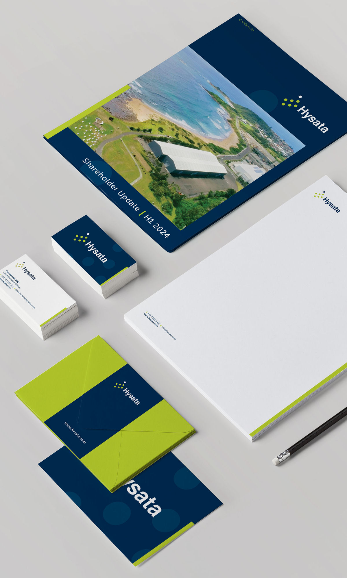
We were brought on by Hysata to create a brand & visual identity to grow with their rapidly scaling company. We designed and built the Hysata brand from the ground up consulting on name development, brand strategy, design of logo, visual identity, stationery suite and rollout of an updated website and marketing collateral. We support Hysata with interior branding and design for events for the fit out of their newly acquired 8000 square meter facility and PR events.
The creation of a brand and visual identity to project the goal size of the company, whilst in its infancy.
To be successful, Hysata needed a brand that could convey their vision as they actively sought funding from potential investors all over the world.
Their global presence brought with it the challenge of designing a visual identity that communicates globally, taking into consideration the psychology of visual perception (how the viewer perceives colour, shape etc) at a global scale.
The resulting visual identity system projects vision and scale and uses abstract simplicity to convey what Hysata does (Hydrogen) whilst being abstract enough to allow the company to pivot as required whilst in the pre-market product development stage.
Hysata’s brand is recognisable across the globe. A successful Series A, saw Hysata secure funding exceeding $40 million AUD. Most recently Hysata announced a record-breaking Series B $172 Million AUD and is rapidly scaling towards production.
Concept
Brand keywords visually represented include — Innovative, Disruptive, Forward-thinking, Focused, Clean, Environmental, Modular, Modern, Timeless.
The circles form an abstract representation of Hydrogen gas, representative of the gas production the company is founded upon.
The placement of each circle is indicative of the movement of gas bubbles in an upward motion (electrolysis) — again representing a key component of the technology.
The circles repeat to represent the modular component Hysata’s breakthrough technology, with the top (breakaway) circle representative of Hysata as a forward thinking leader, breaking away and “ahead of the pack”.
The circle was chosen to represent the cell/gas bubble as a universal symbol, it’s archetype represents wholeness & unity on an individual and global scale — this also relates to the impact Hysata will have on both the individual and global scale.
